 nuxt-toc
nuxt-toc
Nuxt module for table of contents (TOC) component in Nuxt Content projects
nuxt-toc


A Nuxt module for table of contents (TOC) component in your Nuxt Content projects.
Features ✨
- 🎨 Highly Customizable: Tailor it to fit your unique needs.
- 🔍 Active TOC Highlighting: Easily see which section you're in.
- 📦 Out of the Box: Ready to use with minimal setup.
- 🔗 Section Links: Navigate seamlessly within your content.
- ♿ ARIA Support: Ensures accessibility for all users.
- 🆓 Free and Open Source (MIT License): Enjoy the freedom to use, modify, and distribute.
Quick Start 🔧
- Install the module to your Nuxt application:
npx nuxi module add nuxt-toc
- Add
<TableOfContents />at where you need the TOC.
<template>
    <ContentDoc />
    <TableOfContents />
</template>
You can also pass in TOC yourself to prevent duplicate fetching.
<template>
    <ContentRenderer :value="data" />
    <TableOfContents :toc="data.body.toc" />
</template>

<script setup>
const route = useRoute()

const { data } = await useAsyncData('home', () => queryContent(route.path).findOne())
</script>
Props
| Prop | Type | Default | Description |
|---|---|---|---|
toc | JSON | null | Use the provided toc data. If toc is passed in, this component will not fetch TOC info itself and path prop will be ignored. |
path | String | '' | The path to the content for which the TOC is generated. Defaults to using the current URI if not set. |
isSublistShown | Boolean | true | Determines whether the sublist within the TOC is shown. |
isTitleShownWithNoContent | Boolean | false | Determines whether the title is shown even if there is no content in the TOC. |
title | String | 'Table of Contents' | The title of the TOC. |
Styling
| ID/Class | Type | Description |
|---|---|---|
toc-container | ID | The container for the table of contents (TOC). |
toc-title | ID | The title of the table of contents. |
toc-item | Class | General class for TOC items. |
toc-topitem | Class | Specific class for top-level TOC items. |
active-toc-item | Class | Applied to active TOC items. |
active-toc-topitem | Class | Applied to active top-level TOC items. |
toc-link | Class | General class for TOC links. |
toc-toplink | Class | Specific class for top-level TOC links. |
toc-sublist | Class | Styles the sublist within the TOC. |
toc-subitem | Class | Specific class for sub-level TOC items. |
active-toc-subitem | Class | Applied to active sub-level TOC items. |
toc-sublink | Class | Specific class for sub-level TOC links. |
toc-item-${link.id} | ID | Dynamically generated ID for each TOC item, based on the link.id. |
toc-topitem-and-sublist | Class | Styles the top-level TOC items and their sublists. |
!NOTE The default styling of the
<TableOfContents />component is:.active-toc-item { color: #fef08a; } .toc-sublist-item { padding-left: 1rem; } a { text-decoration: none; color: inherit; } ul, ol { list-style: none; padding: 0; margin: 0; }You can customize the style or reset it with:
.active-toc-item {
  color: initial;
}

.toc-sublist-item {
  padding-left: initial;
}

a {
  text-decoration: underline;
  color: initial;
}

ul,
ol {
  list-style: initial;
  padding: initial;
  margin: initial;
}
Cookbook
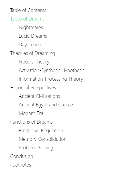
Example One
Custom color for active items and custom padding for subitems
<template>
    <ContentDoc />
    <TableOfContents />
</template>

<style>
/* Styling for active Table of Contents items */
.active-toc-item {
  color: #4ade80;
}

/* Indentation for second-level Table of Contents items */
.toc-sublist-item {
  padding-left: 1.5rem;
}
</style>

<!-- Or with Tailwind CSS
<style>
.active-toc-item {
  @apply text-green-300
}

.toc-sublist-item {
  @apply pl-1.5
}
</style>
-->
Result:
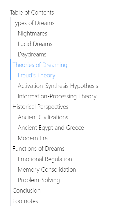
Example Two
Having a bar at left of each item
<template>
    <ContentDoc />
    <TableOfContents />
</template>

<style>
.toc-item {
  border-left-width: 2px;
  border-left-style: solid;
  border-color: #e5e7eb;
  padding-left: 0.25rem /* 4px */;
}

.active-toc-item {
  color: #60a5fa;
  border-color: #60a5fa;
}

.toc-sublist-item {
  padding-left: 1rem;
}
</style>

<!-- Or with Tailwind CSS
<style>
.toc-item {
  @apply border-l-2 pl-1
}

.active-toc-item {
  @apply text-blue-400 border-blue-400
}

.toc-sublist-item {
  @apply pl-4
}
</style>
-->
Result:
Example Three
First level titles be active when any of it's second level titles be active.
<template>
    <ContentDoc />
    <TableOfContents />
</template>

<style>
/* Sublist item is contained in sub list, which is top item's sibling */
.active-toc-item, .toc-topitem:has(+ .toc-sublist .active-toc-sublist-item) {
  color: #60a5fa
}

.active-toc-sublist-item {
  color: #4ade80
}

.toc-sublist-item {
  padding-left: 1rem /* 16px */;
}
</style>

<!-- Or with Tailwind CSS
<style>
.active-toc-item, .toc-topitem:has(+ .toc-sublist .active-toc-sublist-item) {
  @apply text-blue-400
}

.active-toc-sublist-item {
  @apply text-green-400
}

.toc-sublist-item {
  @apply pl-4
}
</style>
-->
Result:

License
This project is under MIT license.